Attack Surface Dashboard and Widget Builder for Reporting
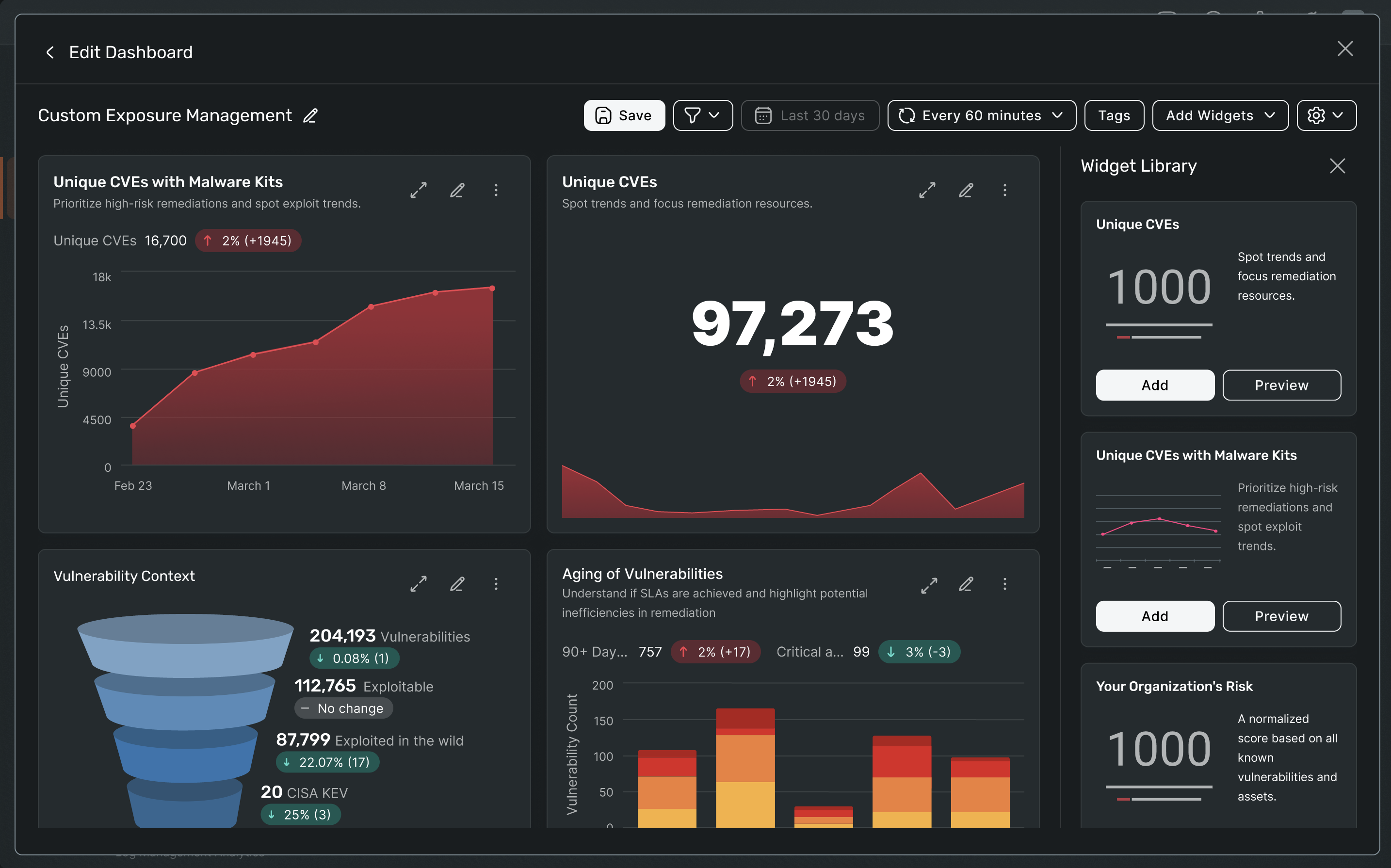
01. Project introduction
What the Attack Surface Dashboard is
The Attack Surface Dashboard gives users a central, real-time view of the assets in their environment. It highlights exposure, risk and overall security posture in one place, helping users understand where they stand at a glance.
It brings together visibility across both:
- Internal attack surface — assets and exposures that could be exploited after someone gains initial access
- External attack surface — internet-facing assets and vulnerabilities that can be discovered from outside the organisation
Although the dashboard reflects live data, users also need to export snapshots of their attack surface. These are typically shared as PDFs to support reporting and conversations with stakeholders.
What the widget builder is
The widget builder is a tool that allows users to create and customise visual widgets without writing complex queries. For attack surface reporting, it enables users to select the metrics, trends and signals that matter to them and turn that data into clear, actionable reports.
Why this was needed
Customers needed a single place to understand:
- What assets they have
- How those assets are exposed
- Where to focus their attention and action
Previously, they had to piece this information together across multiple products and views. This work aimed to bring that visibility and control into one coherent experience.
An attack surface dashboard is not only about operational visibility, but also about meeting compliance and regulatory obligations. Many organisations are required to maintain an accurate inventory of assets, continuously monitor for vulnerabilities, and demonstrate that risks are being identified and addressed in a timely manner. Standards such as ISO 27001, SOC 2, and industry-specific regulations expect clear evidence of oversight and control.
Without a reliable view of their attack surface, teams struggle to prove that they understand what assets they own, which ones are exposed, and how risks are being prioritised. Reporting becomes manual, fragmented and time-consuming. In the event of an audit, security review or breach investigation, this lack of clarity can lead to failed audits, financial penalties, reputational damage and loss of customer trust.
A centralised dashboard, paired with exportable reports, gives organisations a defensible record of their security posture. It helps them demonstrate due diligence, show progress over time, and communicate risk clearly to leadership and external stakeholders.
02. The Problem
Attack surface reporting presents several challenges:
- Data spans many asset types and signals, each with different levels of risk, ownership, and relevance
- Presenting this data meaningfully risks either overwhelming users or oversimplifying critical details
- Effective widgets and flows must work end to end, from configuration through ongoing use
- Existing reporting relies heavily on complex queries and static configurations
- Important context is often lost during report creation
- Reporting feels disconnected from day-to-day security workflows
- Only experienced users can confidently create or adapt reports
As a result, reporting becomes a technical task rather than an intuitive way to understand and communicate risk.
03. Discovery and Research
Use Cases and User Stories
While Assets and Identities focuses on searching for and managing individual assets, the Attack Surface Dashboard serves a different user goal. Its primary purpose is to support awareness, assessment, and prioritisation of risk at an environment level.
Defining use cases and user stories separately ensured:
- Asset workflows focused on finding, organising, and acting on specific assets
- Dashboard workflows focused on high-level visibility, trends, and decision-making
This separation helped the dashboard complement the asset experience rather than duplicate it.
User Interviews
Throughout discovery, we spoke with customers on a continual basis. A consistent theme emerged: while existing reporting capabilities were adequate, the experience of building reports was cumbersome.
Key insights included:
- Users preferred more visual ways to explore and query data
- Query-heavy or table-based approaches often caused insights to be lost
- Users wanted clarity without sacrificing analytical depth
These insights directly shaped the direction of both the dashboard and widget builder.
User-Defined Context
Interviews also highlighted a critical need for users to apply their own business, operational, and security context to attack surface data.
While the platform can surface signals and changes, users made it clear that:
- Only they understand the intent behind changes in their environment
- The same signal can represent risk in one organisation and expected behaviour in another
As a result, the platform cannot reliably determine whether a change is "good" or "bad" without user input. This reinforced the importance of designing experiences that support user-defined context and interpretation, rather than relying solely on automated judgement.
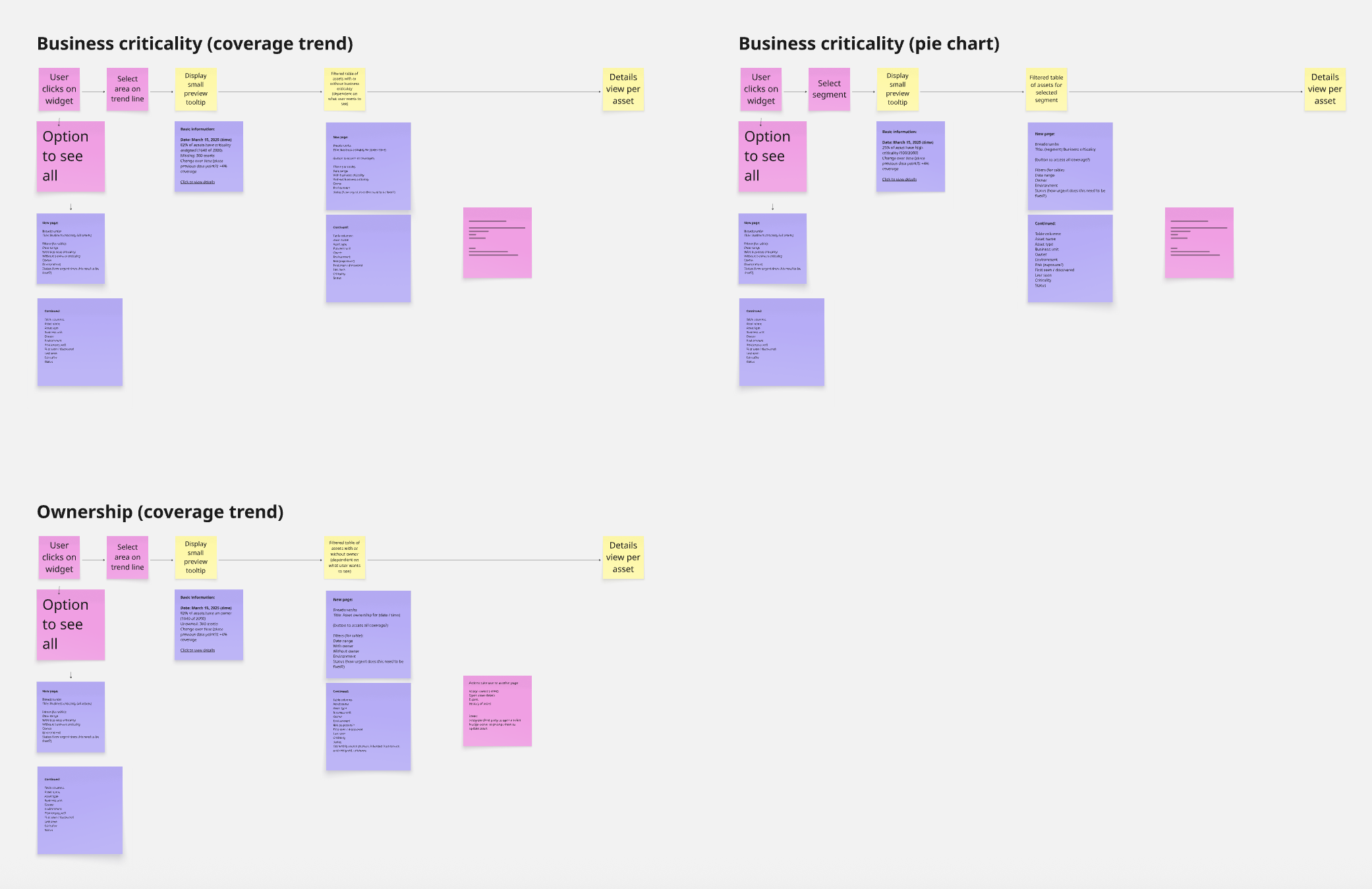
Mapping out widget flows to incorporate user-defined context
Conceptualising the Attack Surface Dashboard required close cross-functional collaboration due to its importance as one of the most requested customer capabilities.
This phase focused on:
- Aligning with the company's long-term platform strategy
- Validating assumptions about data availability, reliability, and limitations
- Shaping concepts that balanced user expectations with technical reality
I worked closely with product, engineering, and data teams to ensure the vision was ambitious but achievable, and could evolve as data capabilities matured.
A key part of this work involved defining the out-of-the-box widgets provided after onboarding, in partnership with Product Management. This helped clarify the flows and requirements needed to support the widget builder itself.
Because the widget builder would be used across multiple reporting contexts, significant effort went into ensuring its flows aligned with established platform patterns. Consistency was critical to reduce cognitive load and create a predictable experience across the platform.
04. Conceptualisation
Conceptualising the Attack Surface Dashboard required close cross-functional collaboration due to its importance as one of the most requested customer capabilities.
This phase focused on:
- Aligning with the company's long-term platform strategy
- Validating assumptions about data availability, reliability, and limitations
- Shaping concepts that balanced user expectations with technical reality
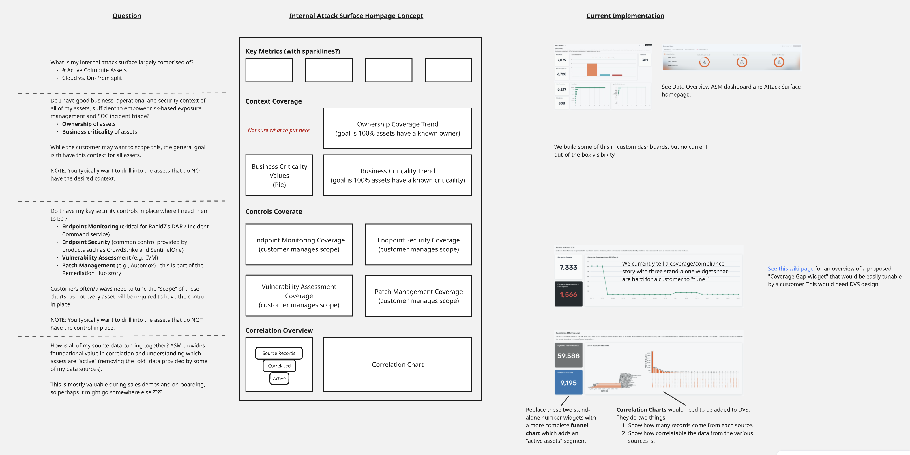
Lo-fi mockups to figure out the dashboard and out of the box widgets that would be needed by the customer
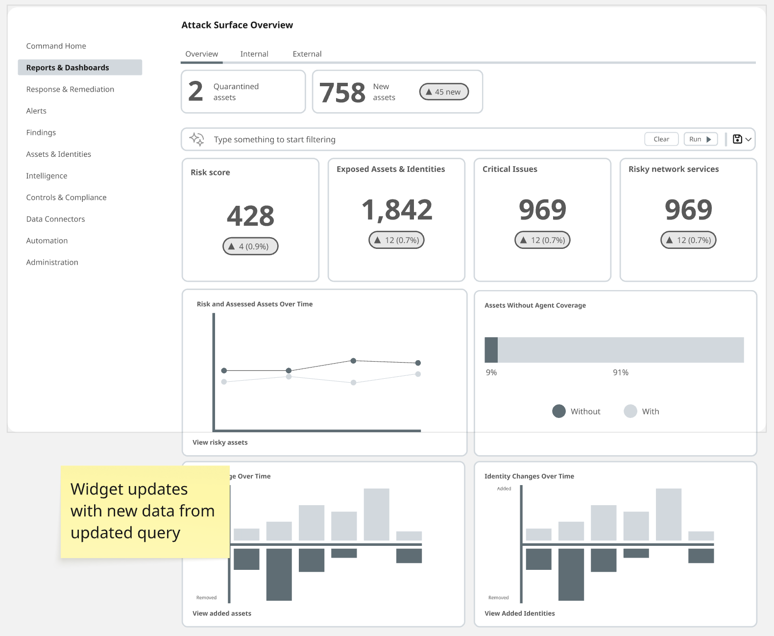
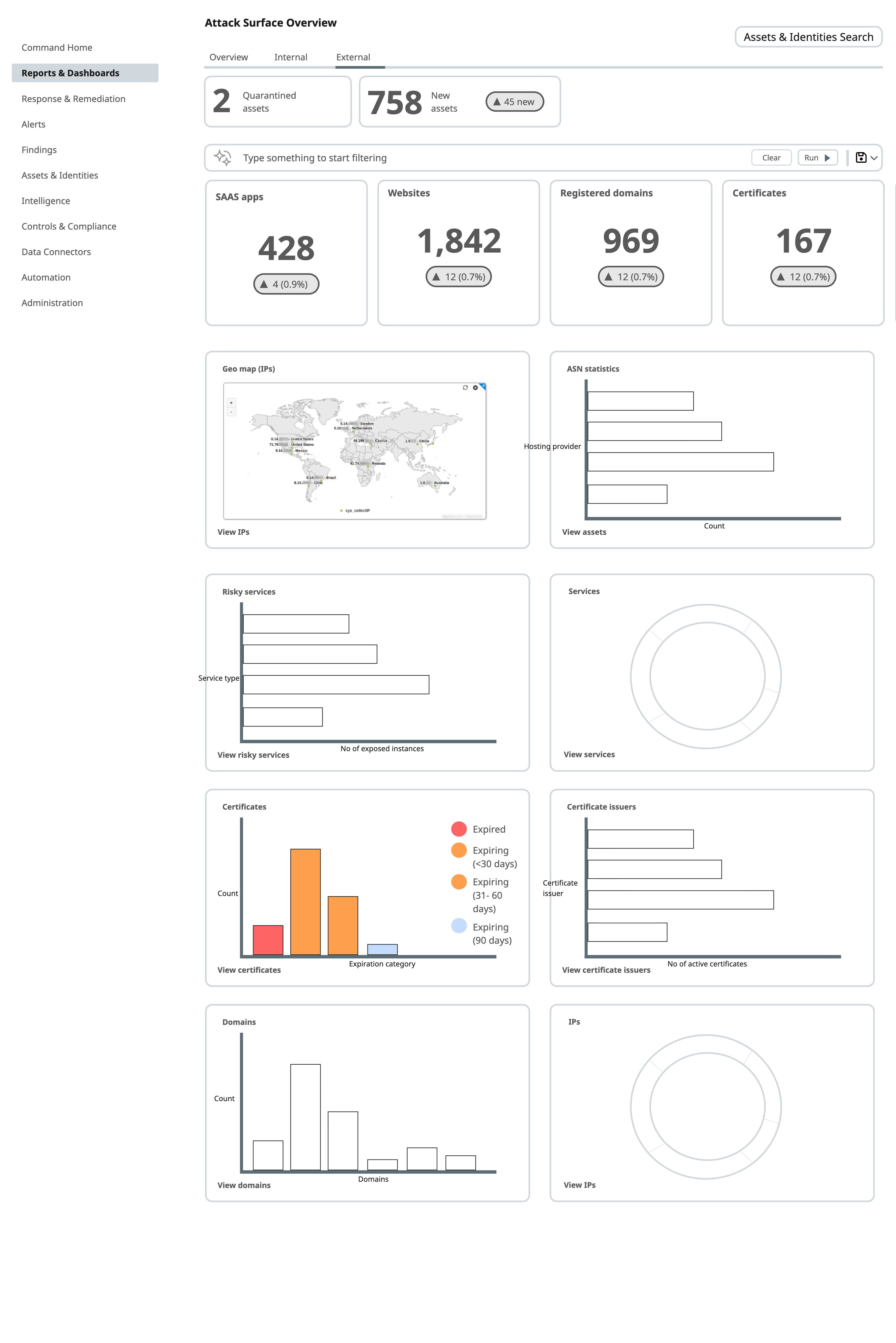
Exploring further lo-fi designs in Miro
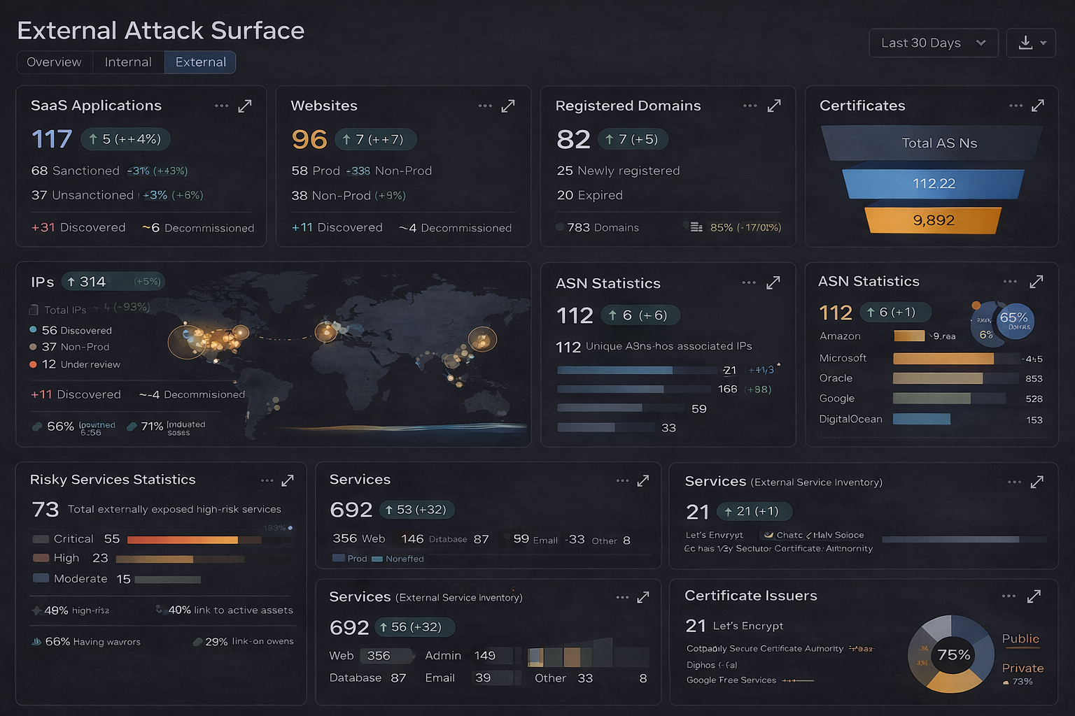
Using AI to mock up hi-fi version of the dashboard
05. Solution
The project delivered two closely connected experiences: the Attack Surface Dashboard and the Widget Builder.
Together, they allow users to explore attack surface data visually, build meaningful reports more easily, and maintain context between high-level insights and deeper analysis.
The Attack Surface Dashboard
The dashboard provides a guided experience for users who want Rapid7 to help them understand and prioritise risk. Once onboarding is complete and data is ingested, users are presented with a curated set of widgets tailored to their environment, asset types, and security posture.
Benefits of a guided, widget-based approach
- Reduces cognitive load by highlighting what matters most
- Helps newer or less mature teams quickly understand their attack surface
- Encourages best-practice security workflows through opinionated insights
- Delivers immediate value after onboarding, reinforcing trust in the platform
Supporting different user needs
- Users who prefer guidance can rely on curated widgets to identify exposure and priorities
- More advanced users can treat the dashboard as a starting point for deeper investigation
The dashboard acts as a bridge between high-level awareness and detailed asset analysis.
The Widget Builder
The widget builder enables users to create customised reports through an intuitive, visual experience rather than complex queries.
Benefits
- Lowers the barrier to reporting by removing technical complexity
- Keeps insights visible and contextual during exploration
- Enables faster report creation through guided configuration and feedback
- Makes reporting accessible to a broader range of roles
Supporting different user needs
- Less experienced users can rely on defaults and pre-configured widgets
- Advanced users can refine and combine widgets for more complex reporting
- Reports can evolve over time without requiring complete rebuilds
This approach transforms reporting from a technical task into a flexible, approachable experience.
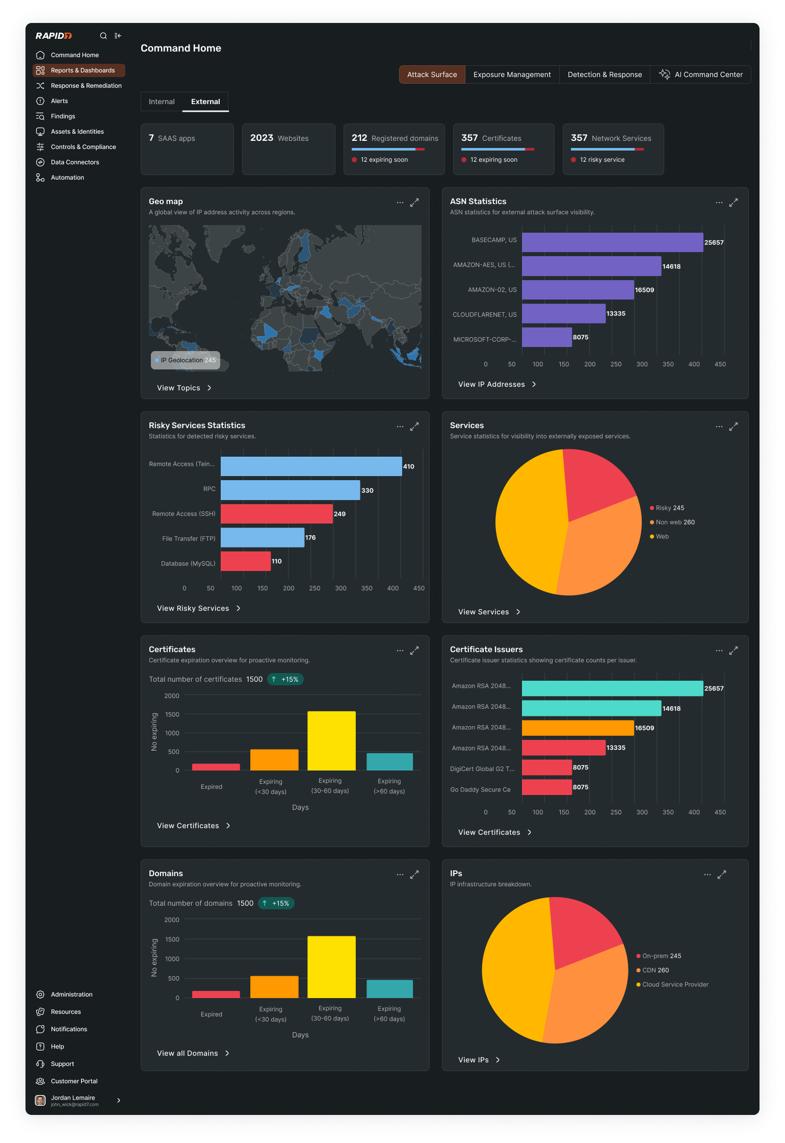
External Attack Surface dashboard
Widget builder experience
06. Results and Learnings
Attack Surface Dashboard
User testing showed the first version of the dashboard was effective as a V1. Users valued the clear, centralised overview and felt it delivered immediate value by surfacing key signals without requiring navigation across products.
Testing also revealed a strong desire for deeper contextual customisation. Users want to apply business, operational, and security context to better interpret risk, reflecting the reality that acceptable behaviour varies across organisations. This will likely need to encompass industry benchmarking so that customers can understand how they're performing within their industry. This will be an additional feature for V2.
Widget Builder
User feedback showed strong interest in the widget builder as a more intuitive alternative to query-based reporting. Participants felt the visual, guided approach reduced friction and made report creation more accessible.
At the same time, testing highlighted the need for future support of third-party integrations. Many users already rely on internal dashboards or external reporting tools and want Rapid7 to help populate those systems rather than operate in isolation. This reinforced the importance of designing the widget builder as a flexible, interoperable reporting layer that can evolve alongside users' broader tooling ecosystems.