Nissan: Car Configurator Redesign
01. Project introduction
This project focused on redesigning the Nissan car configurator to enhance the overall customer experience as part of a wider Global Brand Identity refresh.
The existing desktop and mobile experiences were reviewed to identify usability gaps, inconsistencies, and areas where the journey could be simplified. The aim was to create a more intuitive, engaging, and cohesive configurator that better reflects the updated brand while supporting users in making confident purchase decisions.
The redesign explores how interaction, visual design, and information structure can work together to streamline the configuration process, reduce friction, and create a more premium and consistent experience across devices.
02. The Problem
In today's saturated and highly competitive automotive market, there is an increasing emphasis on personalisation and customer experience. Purchasing a car is a considered decision, often associated with aspiration and luxury, and users expect a seamless, intuitive journey that supports them in exploring options and building confidence in their choices.
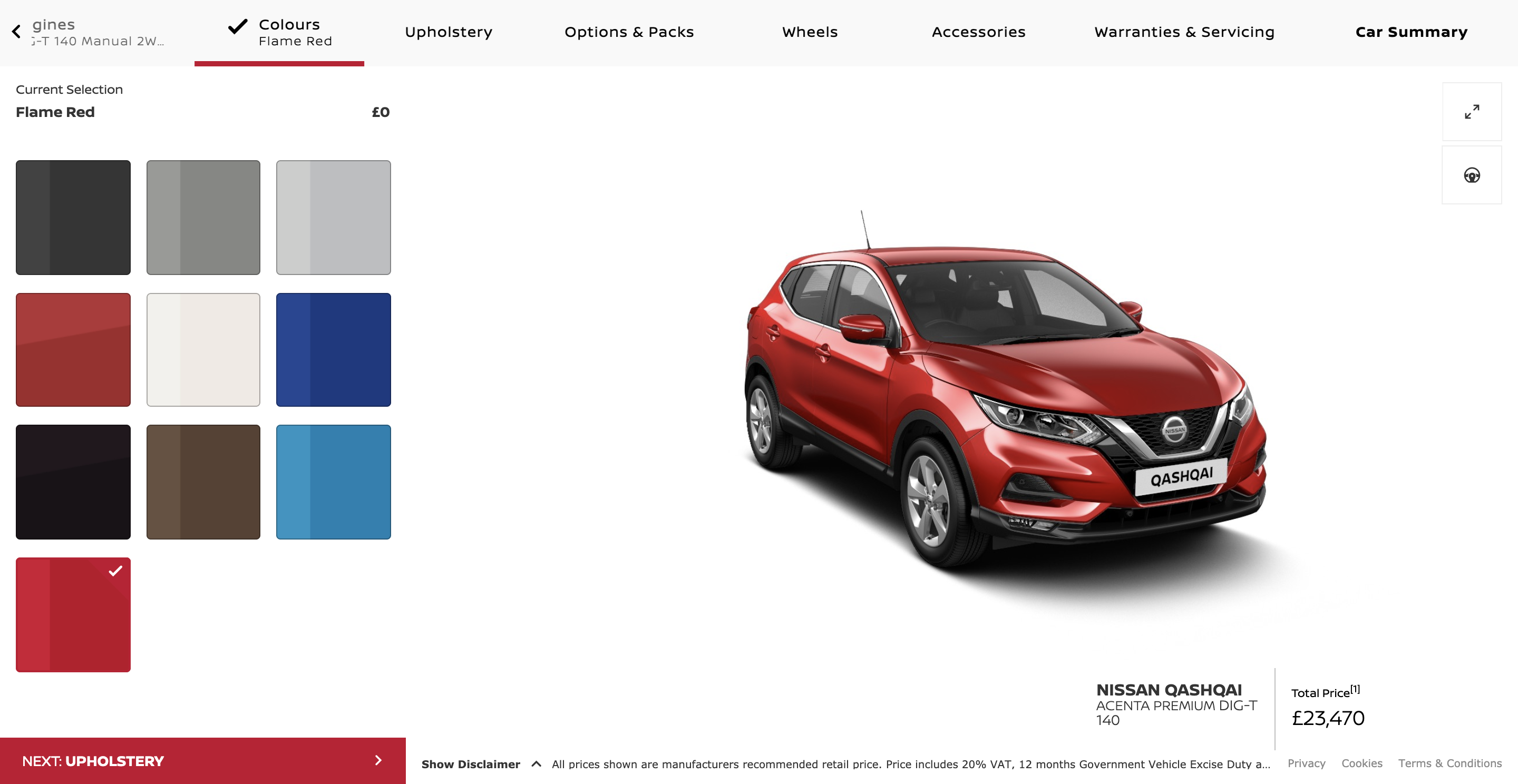
The existing Nissan configurator did not meet these expectations. Both desktop and mobile experiences felt fragmented and difficult to navigate, with unclear progression, inconsistent interactions, and a lack of guidance throughout the journey. Rather than supporting exploration, the experience introduced friction at key decision points.
As a result, users often found the process confusing and, at times, frustrating. This not only diminished the perceived quality of the brand experience, but also impacted business outcomes, contributing to a lower conversion rate from configuration to purchase.
Nissan engaged us to reimagine the configurator as part of their Global Brand Identity refresh. The goal was to create a more intuitive, engaging, and cohesive experience that would better reflect the brand, reduce friction, and ultimately support users in moving confidently from exploration to purchase.
03. Discovery and Research
Competitor Landscape
To better understand user expectations and identify opportunities for improvement, I analysed a range of competitor configurators across the automotive market. This helped me benchmark current experiences and highlight patterns in how leading brands approach personalisation, navigation, and decision-making.
Two standout examples were Ferrari and BMW. Both configurators offered a clear and refined experience, with a strong emphasis on visual quality and ease of use. High-quality graphics allowed users to engage more deeply with the product, while clean layouts ensured that information remained easy to scan and understand.
In addition, pricing was presented transparently throughout the journey, helping users stay informed as they customised their vehicle. The overall flow was intuitive, with a clear sense of progression and minimal friction between steps, making it easy for users to explore options without feeling overwhelmed.
These examples set a benchmark for what a premium configurator experience should feel like: visually engaging, easy to navigate, and supportive of confident decision-making.
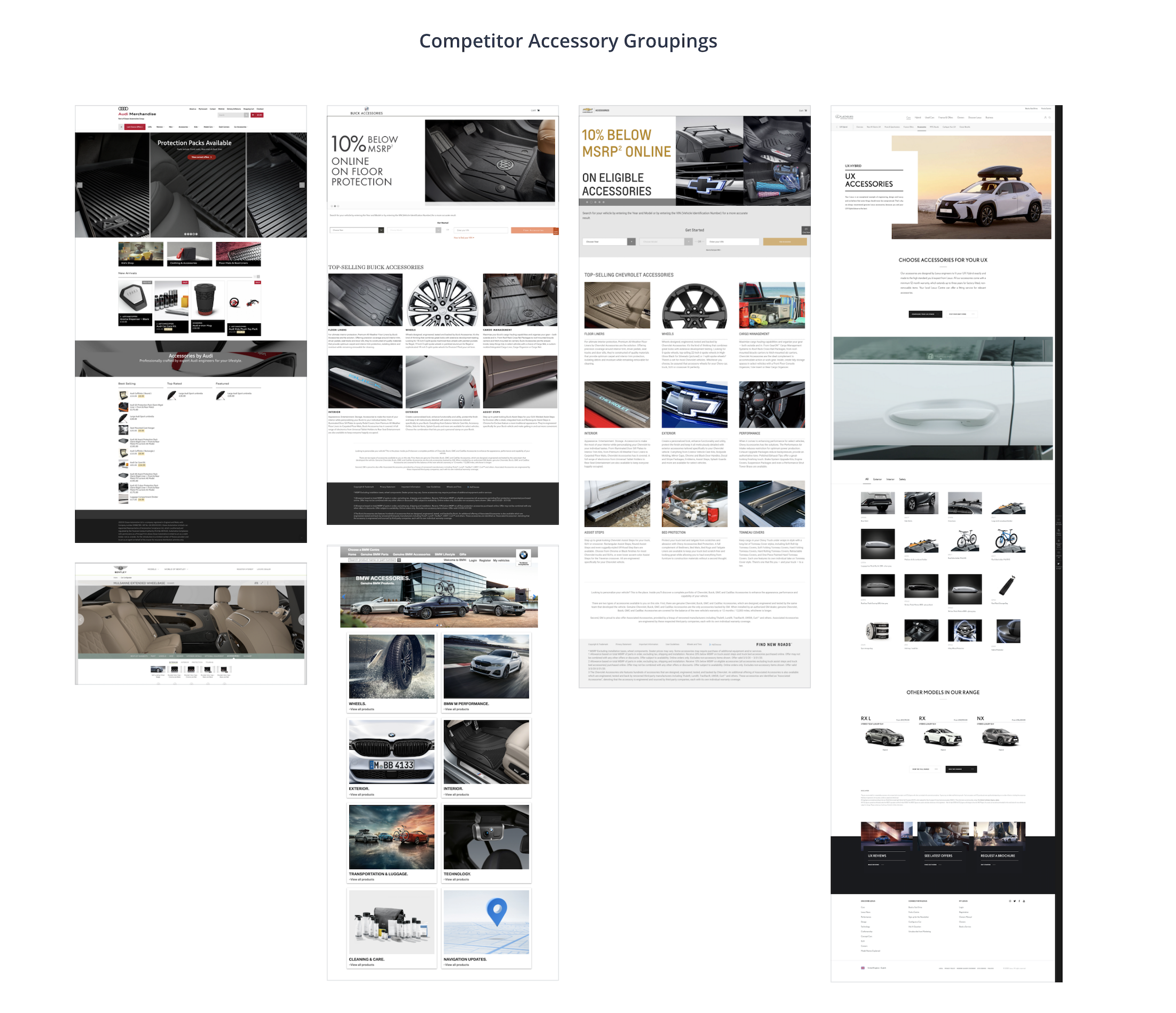
Assessing competitor offerings.
UX Audit
To understand the existing configurator in detail, I carried out a UX audit across Nissan's five key markets: Germany, Australia, Japan, Poland, and the UK.
The audit focused on identifying and documenting all existing components, flows, and configuration "trays" within each market. By mapping what was present in each experience, I was able to create a clear overview of how the configurator was structured across regions, highlighting both consistencies and discrepancies.
This process proved valuable not only for the design team, but also for product and engineering. By establishing a shared understanding of the current state, it became easier to identify overlaps, gaps, and opportunities for standardisation. As a result, design decisions could be made more efficiently, and conversations across teams became more aligned and straightforward.
The audit also revealed significant variation between markets. Each country had a different number of trays and components, as well as differing levels of complexity within the journey. This inconsistency highlighted one of the core challenges of the project: creating a unified configurator that could accommodate multiple markets while maintaining a consistent and intuitive user experience.
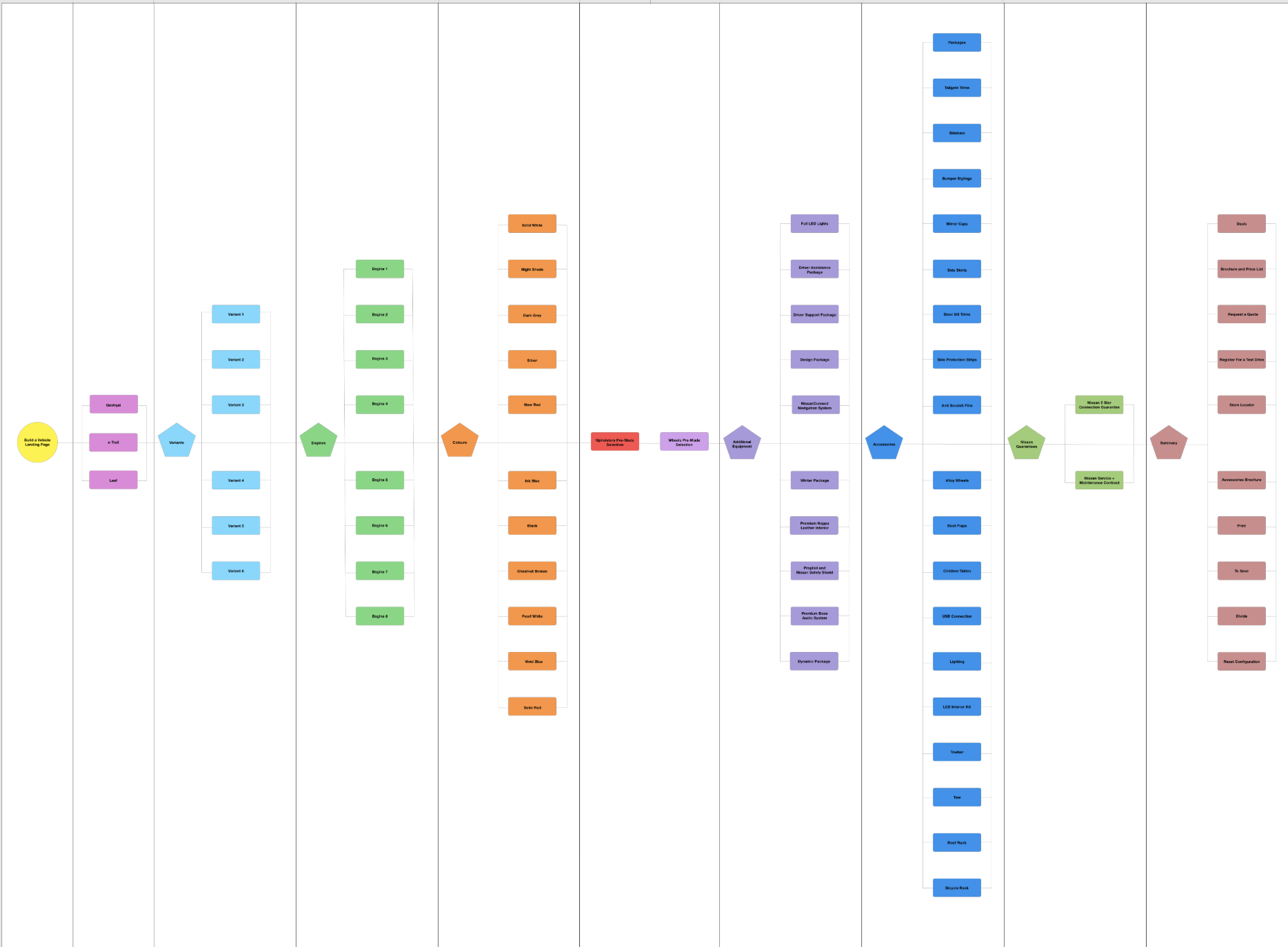
Understanding everything entailed in the configurator.
Remote interviewing & observational research
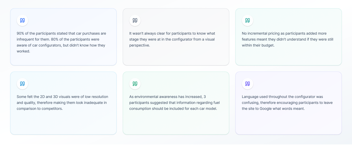
Due to the outbreak of Covid-19, the planned ethnographic interviews had to be adapted and conducted remotely via Zoom to maintain social distancing. While this limited the ability to observe users in their natural environments, it still allowed for valuable qualitative insights into how people interacted with the configurator.
A range of participants were recruited across different demographics and levels of familiarity with car configurators. This included both experienced users, such as car enthusiasts who regularly engage with configurators, and those with little to no prior experience. This mix helped uncover both expert expectations and first-time user challenges.
During the sessions, interviewees were asked to navigate the configurator while thinking aloud, sharing their thoughts, reactions, and feelings as they progressed. Open-ended questions were used to explore their understanding of the journey, points of confusion, and moments where the experience either supported or hindered decision-making.
However, the remote setup introduced some limitations. Due to technical constraints, it was only possible to track and analyse user behaviour on desktop, meaning that mobile interactions could not be heat mapped or observed in the same way. Instead, insights into the mobile experience relied heavily on participant commentary.
This presented a challenge, particularly as Nissan's research indicated that a significant portion of their users are mobile-first. As a result, while the research provided valuable directional insights, it also highlighted the need for further validation of mobile-specific behaviours in future iterations.
User Journey Mapping
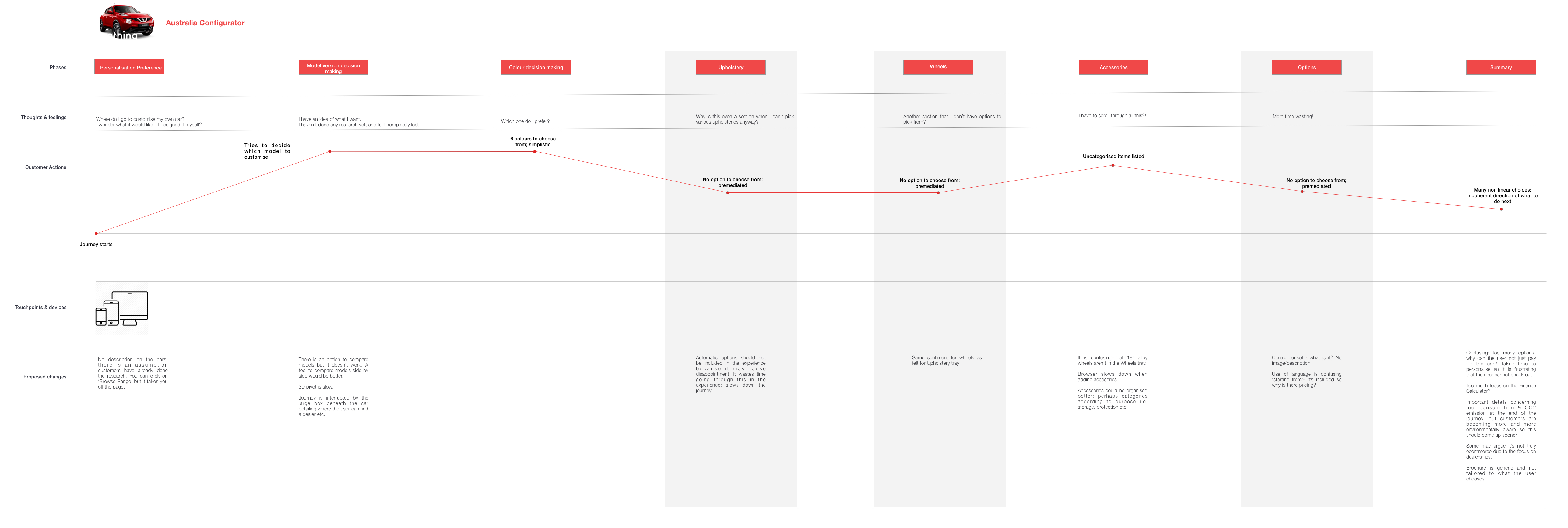
To better understand how users navigated the configurator across different regions, I created detailed user journeys for each of the five principal markets. These journeys mapped the end-to-end experience, from initial entry through to configuration completion, highlighting key touchpoints, decision moments, and areas of friction.
By visualising the experience in this way, it became easier to identify patterns in user behaviour, as well as inconsistencies between markets. This allowed for clearer opportunities to streamline the journey, reduce unnecessary steps, and create a more intuitive flow in the redesigned configurator.
Each journey was built around a core persona: a 25-year-old first-time car buyer with little to no experience using configurators. This perspective ensured the focus remained on clarity, guidance, and ease of use, rather than assuming prior knowledge. It also helped uncover areas where the existing experience relied too heavily on user familiarity, resulting in confusion or hesitation.
Using this persona as a baseline, the journeys emphasised moments where users required additional support, clearer feedback, or more structured progression. These insights directly informed design decisions, helping shape a simpler, more guided experience that could better accommodate both new and more experienced users.
04. Conceptualisation
Building on the insights from the audit and user research, the redesign focused on rethinking the configurator as a guided, intuitive journey rather than a collection of disconnected options.
The primary goal was to reduce complexity while still supporting a high level of personalisation. This meant shifting from a feature-led experience to a user-led one, where decisions are structured, clearly explained, and easy to navigate regardless of prior knowledge.
Structuring the Journey
The configurator was redesigned around a clear, step-by-step progression. Each stage focuses on a single decision, such as model, engine, exterior, or interior, helping users move through the experience with a stronger sense of direction and control.
This approach reduces cognitive load and prevents users from feeling overwhelmed by too many options at once. It also introduces a more logical flow, guiding users from high-level choices through to more detailed customisation.
Introducing Guidance and Support
To better support first-time users, guidance was embedded throughout the experience. This included clearer descriptions, contextual explanations, and prompts to help users understand the impact of their choices.
A key consideration was the introduction of a diagnostic or recommendation approach, particularly for more complex decisions such as engine selection. This helps users who may not know what they are looking for, while still allowing more experienced users to explore freely.
Simplifying Information Architecture
The redesign focused on simplifying and rationalising the structure of trays and components. Overlapping categories were reduced, and content was reorganised to remove duplication and confusion, particularly within the Accessories and Options areas.
Clearer grouping and hierarchy ensured that users could easily understand where to find information, and how different options relate to one another.
Enhancing Transparency and Feedback
Users were given clearer feedback throughout the journey, including real-time updates to pricing and configuration changes. This helped maintain a sense of control and awareness as they customised their vehicle.
In addition, technical jargon was reduced or supported with accessible explanations, ensuring that all users could engage with the configurator without needing prior expertise.
Creating a Cohesive Cross-Platform Experience
Finally, the experience was designed to work consistently across desktop and mobile. Particular attention was given to mobile interactions, ensuring that navigation, selection, and information display remained clear and usable on smaller screens.
Overall, the conceptual approach focused on creating a configurator that feels structured, supportive, and engaging, enabling users to move confidently from exploration to decision-making.
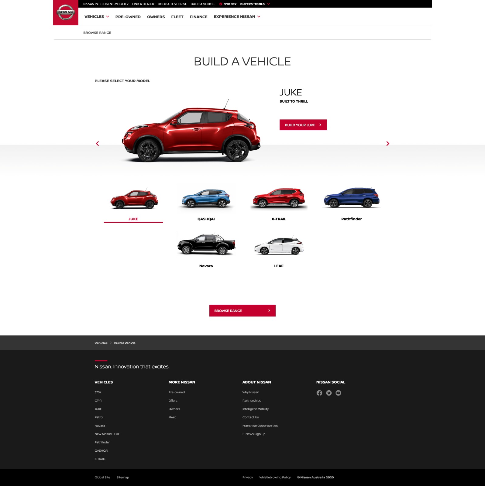
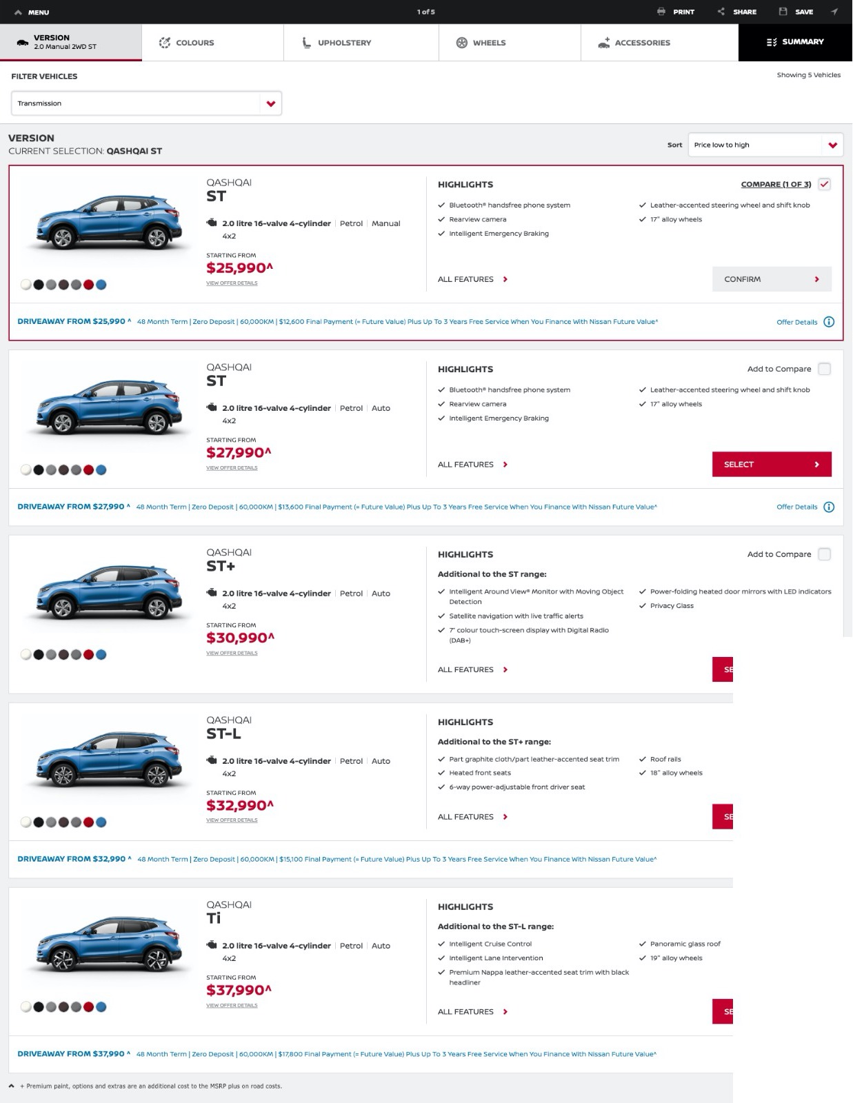
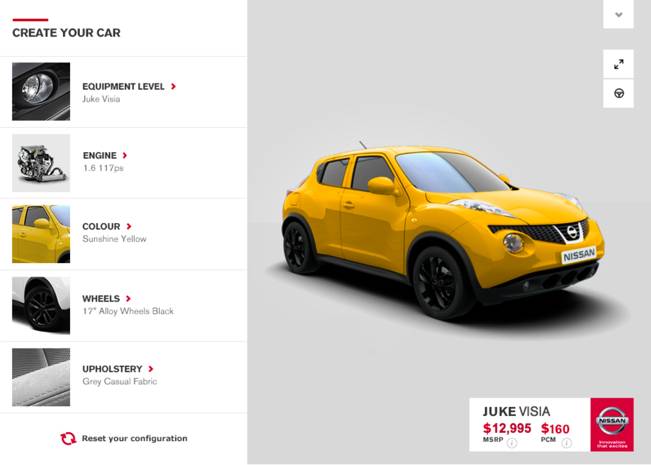
Screenshots from the former configurator.
05. Solution
Following the analysis of the configurator journeys, several key issues emerged that were impacting both usability and overall experience quality.
Lack of guidance for new users
The configurator was not designed with first-time buyers in mind. Users who were unfamiliar with car configuration were given little support in understanding what to choose or where to begin. This was particularly evident when selecting technical options such as the engine. Introducing a form of guided or diagnostic tool could help users make more confident decisions.
Unclear pre-configured options
Pre-meditated customisations were included in the configurator without clear explanation, particularly when these options could not be changed. This created confusion and reduced the sense of control for users, leading to frustration and potential disappointment when they were unable to explore alternative configurations.
Overwhelming accessory tray
The Accessories tray lacked clear organisation, making it difficult for users to navigate and understand the available options. This slowed down the journey and added unnecessary friction. In addition, the presence of packs within the Accessories tray created duplication and confusion, as there was already a separate Options and Packs section.
Use of unclear jargon
The configurator relied heavily on vehicle-specific terminology without providing sufficient explanation. For users who were not familiar with this language, this made the experience harder to understand and less accessible, further increasing cognitive load throughout the journey.