Unified Assets
01. Project introduction
As customers adopted more of Rapid7's products, their assets became spread across multiple tools and screens. This made it harder to get a clear picture of their environment and slowed down everyday tasks. There was growing pressure to unify assets into one view so users could quickly understand what they have, spot issues, and take action without switching between products.
02. The Problem
Designing a unified asset experience is complex because not all assets work the same way. Different asset types have different data, statuses, and actions. Some change frequently, while others follow completely different lifecycles. If everything is forced into one rigid pattern, important details can get lost, or the experience can become overly complicated.
The challenge was to create a consistent structure that feels familiar across assets, while still allowing enough flexibility to support different user goals and workflows without losing important context.
03. Discovery and Research
Use cases and user stories
Why this work was needed
Assets were defined and handled differently across products, leading to conflicting assumptions and inconsistent workflows. Designing a unified experience without grounding it in real user behaviour risked prioritising one product or user type over others.
Developing use cases and user stories helped shift the focus away from product structures and towards what users were actually trying to achieve.
What this revealed
Looking across products surfaced common asset-related tasks such as finding, investigating and taking action. It highlighted where workflows overlapped, where they diverged, and where friction was introduced. It also exposed edge cases and lifecycle states that were not visible when each product was considered in isolation.
Value to the unified experience
This work established a shared mental model for assets across the platform. It clarified which behaviours should be standardised and where flexibility was needed. It also created alignment across design, product and engineering by introducing a common language, and laid the groundwork for supporting future asset types and products in a scalable way.
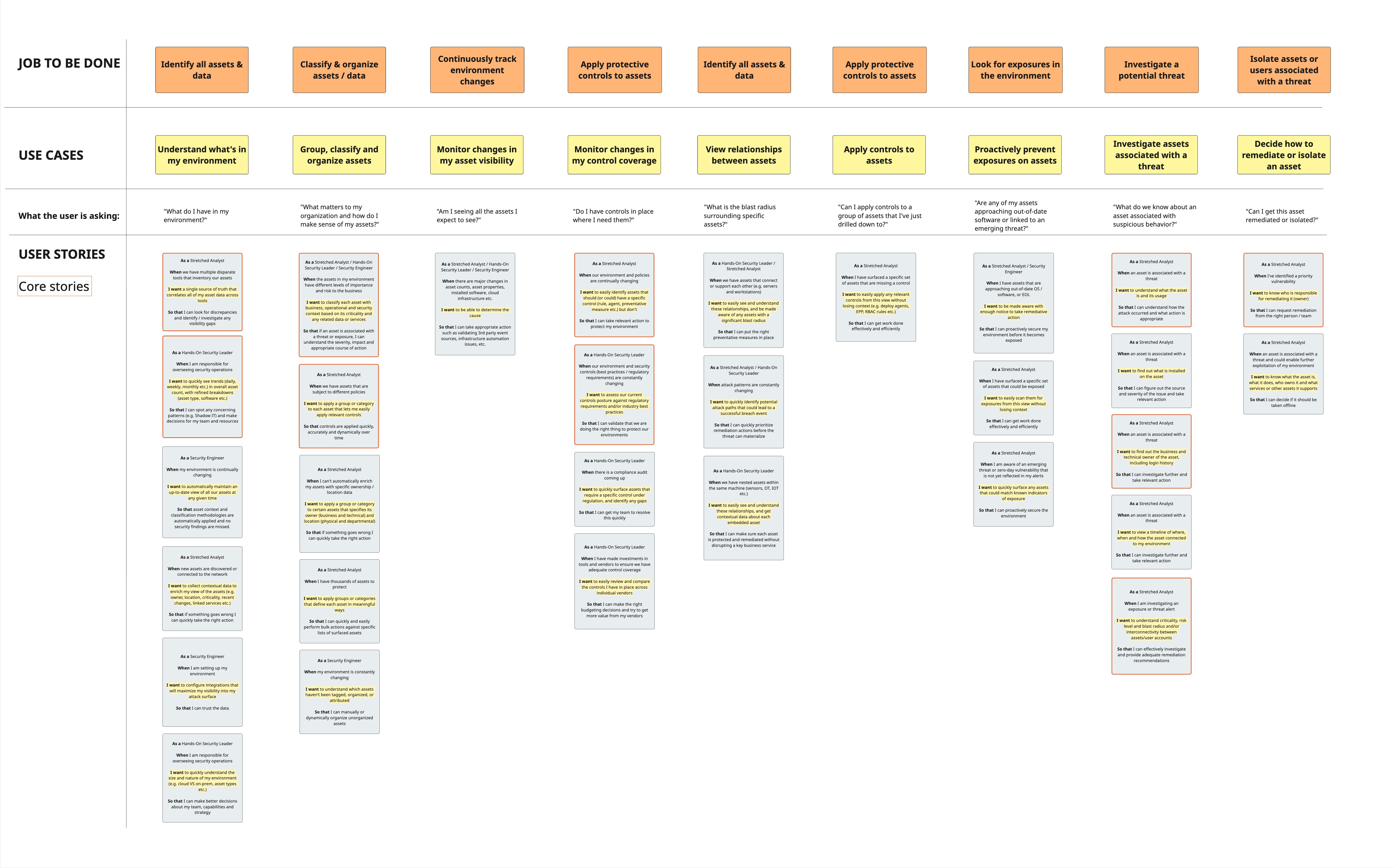
Use cases and user stories for unifying assets
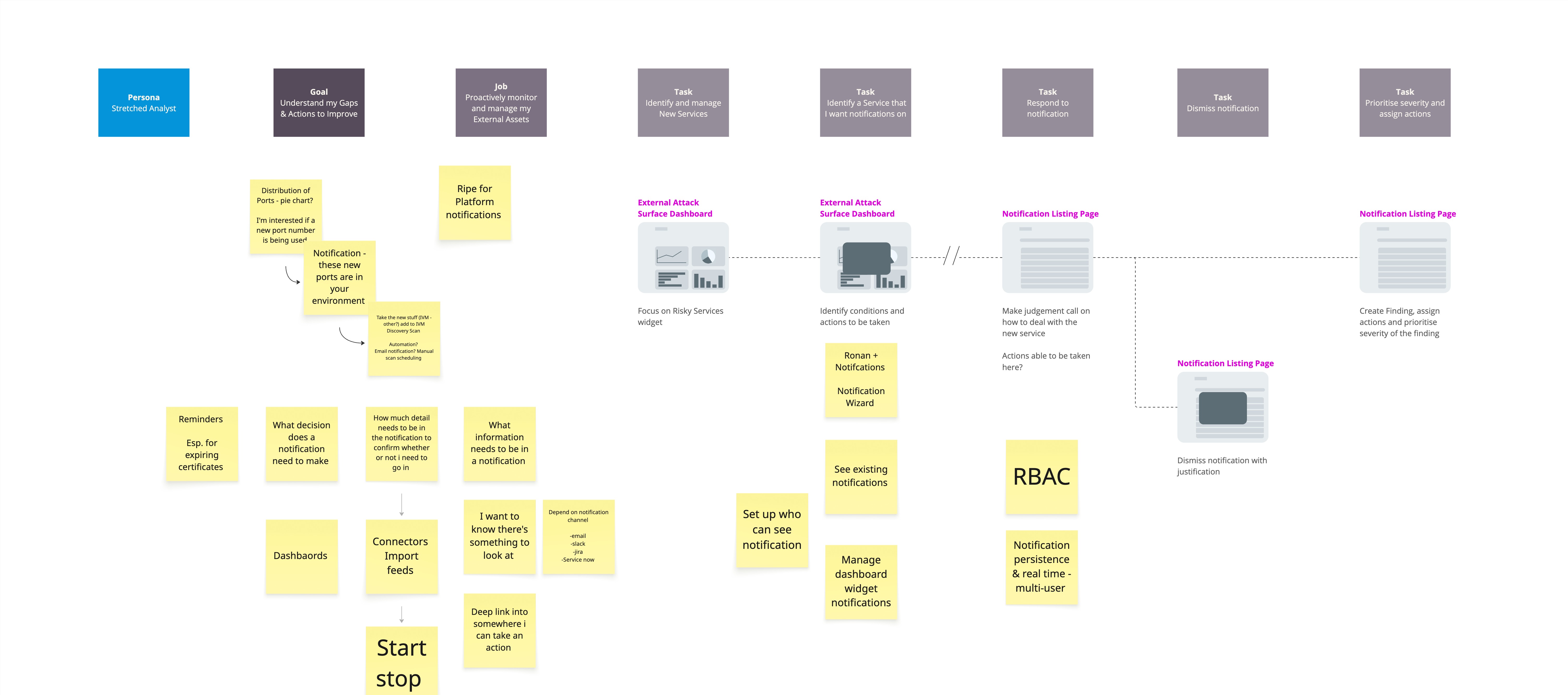
User flow for a Stretched Analyst persona
Product Audit
To design a unified experience, we first needed a clear view of how assets were currently defined, presented, and managed across siloed products. Each product had evolved independently, resulting in inconsistent terminology, workflows, and interaction patterns.
The audit allowed us to:
- Identify all asset types and where they lived across the platform
- Surface inconsistencies in states, behaviours, and language
- Understand overlaps, gaps, and duplicated functionality
- Distinguish core asset needs from product-specific requirements
This work created a shared baseline that enabled informed decisions about what to standardise, what to keep flexible, and how to unify without adding complexity.
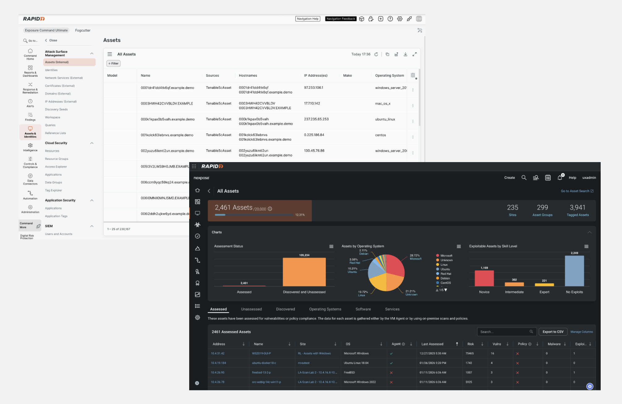
Examples of two siloed products with managing assets as part of their product offering
User Interviews and Insights
Interviews with both external customers and Customer Zero users revealed a consistent need for a single, unified way to view and manage assets.
Key insights
- Users think in environments, not products
Product boundaries are invisible to users and add unnecessary complexity. - Overview first, detail on demand
Users want a high-level view to prioritise, with the ability to drill into asset detail when needed. - Personal relevance drives value
Users want to define and save views based on what matters to them, such as risk, ownership, or operational state. - Search and organisation are core workflows
Fast, flexible search and grouping are primary tasks, not secondary features. - Action should live where understanding happens
Users want to act on assets directly from where they view them.
04. Conceptualisation
During discovery, we learned that most users do not want to regularly search through a complete list of their assets. Their goal is not to browse, but to focus on what needs attention. They care most about assets that are misconfigured, missing controls, newly exposed, or behaving unusually, as well as assets that are business-critical, externally facing, or tied to compliance requirements. Users consistently said they would rather start with a clear, accessible overview of what requires action that day. Instead of digging through large tables, they want a prioritised view that highlights risk, importance, and next steps so they can make decisions quickly and move on with confidence.
Information Architecture
Defining the information architecture required alignment at a platform level, not just within a single product.
We partnered with content design to create a shared asset model and align terminology across teams. This helped establish a single source of truth and reduced inconsistencies that had built up over time.
There were also navigational challenges. Platform principles required the removal of secondary navigation, which meant rethinking how asset-related features were structured. Early concepts grouped functionality under Assets and Identities, including a landing dashboard. However, dashboards already existed under Reports and Dashboards, and duplicating this pattern created confusion.
By reviewing the wider platform IA, it became clear that Assets and Identities should focus on supporting task-based workflows. We reframed it as a space for searching, organising and managing assets, rather than a reporting destination.
This shift resulted in a clearer structure that aligned more closely with user intent and established platform principles.
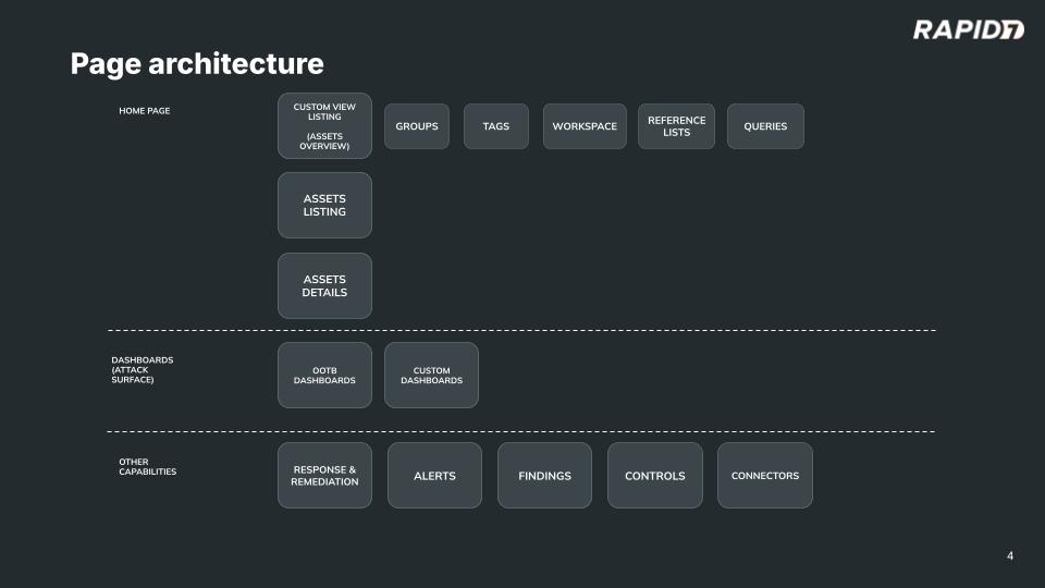
Making sense of the IA in line with the Assets content model
Wireframing
With the content model and IA in place, myself and the designer I was working with moved quickly into collaborative exploration.
How we worked
- Whiteboard sketching during live collaboration sessions
- Rapid low-fidelity wireframes in Miro
- Frequent iteration through discussion and feedback
What we explored
- Core asset management flows grounded in the unified IA
- A visual explorer concept for browsing assets outside traditional tables
The visual explorer emerged from interviews where users expressed interest in:
- Faster understanding at a glance
- Better pattern recognition across assets
- A smooth transition from overview to action
Technical constraints
- A single table could not support multiple asset types due to differing data models
- Column inconsistency made unified tables hard to scale
This early exploration allowed us to test assumptions quickly and align as a team.
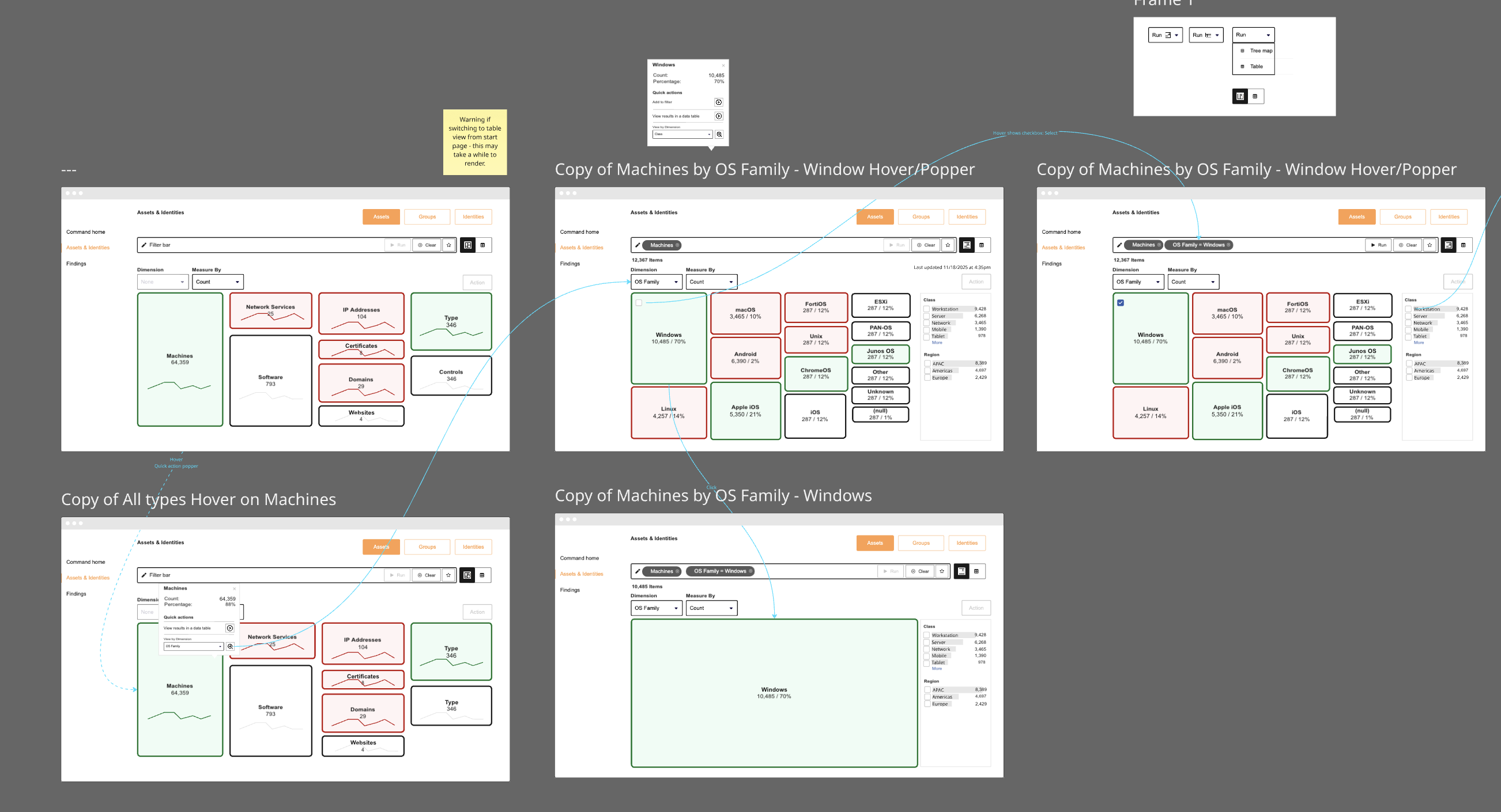
Lo-fi mock ups of the visual explorer
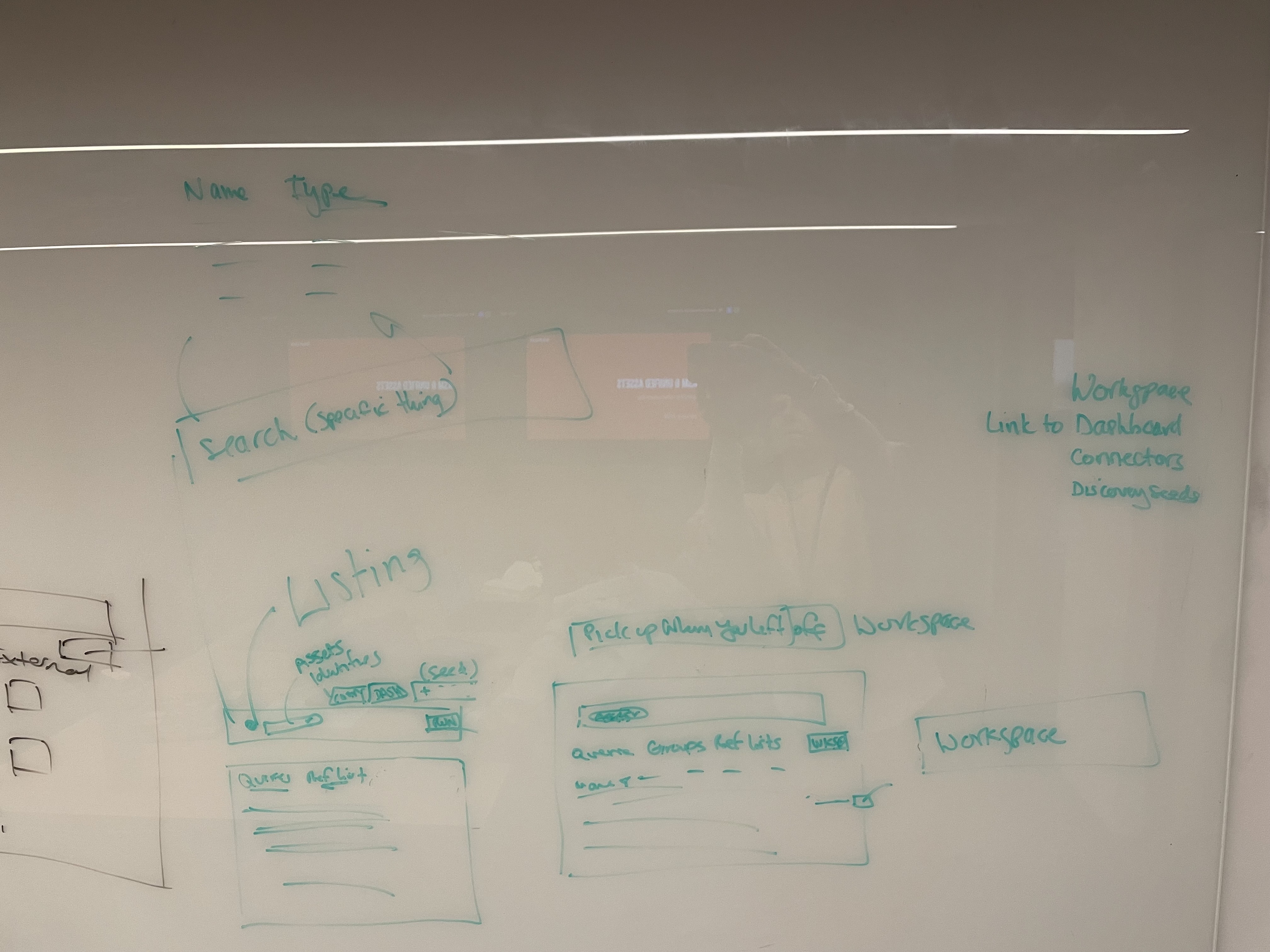
Whiteboard sketching
05. Solution
Once concepts were aligned, design work progressed in parallel between myself and another designer. This allowed for efficient delivery while maintaining consistency across the experience.
All designs were reviewed with the design system team to ensure:
- Alignment with unified platform patterns
- Consistency in components and interactions
- Scalability and long-term maintainability
This ensured the final experience felt cohesive and integrated within the broader platform.
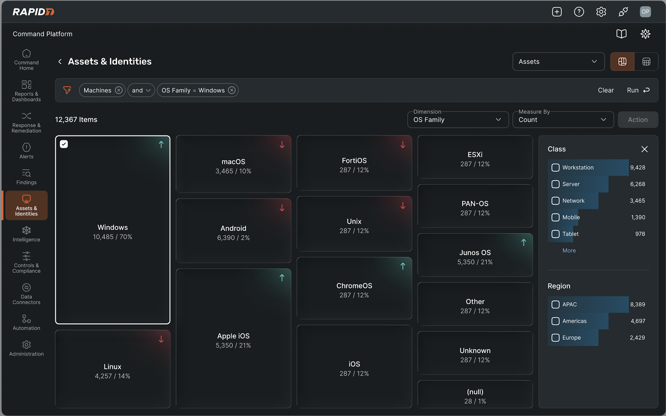
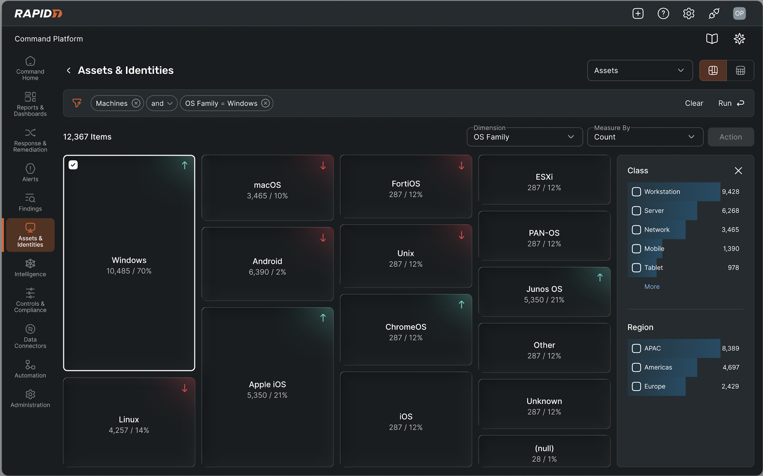
Hi-fi mockup of the visual explorer which allows users to visually explore the assets across their environment without going into detail. The option to use a filtered table is still available.
If a user wants to use the table (more likely for a power user), they can click into an asset and explore its details. All information for that asset is available here. Users expressed they want to be able to click about in the same real estate.
06. Results and Learnings
What worked
- Unifying assets reduced fragmentation and improved environmental awareness
- Users valued a single place to search, organise, and act on assets
- Clear IA and shared patterns increased predictability and confidence
Insights from testing
- Asset searches are goal-driven, such as investigating issues or validating changes
- Speed, precision, and control mattered more than exploration
- The visual explorer felt slower than direct search and filtering
Power user feedback
- Power users relied on complex querying and advanced filters
- The visual explorer did not support these workflows
Evidence-based decisions
- Feedback consistently showed misalignment between the visual explorer and real workflows
- Insights were validated across customers and internal users
- Decisions were based on observed behaviour rather than design preference
Reflection & pivot
As we explored different concepts, we realised that while users do want to explore their assets easily, they do not necessarily need a new visual exploration tool to do so. The platform already includes a dedicated Dashboards area, including an Attack Surface dashboard that can be customised to display asset data in ways that suit different roles and priorities. Creating another dashboard-style experience within Assets risked duplicating functionality and blurring the purpose of each area.
We also tested a tree diagram approach to help users navigate relationships between assets. Although visually interesting, feedback suggested that this format would slow users down. Most participants were focused on efficiency. They wanted to scan, filter and act quickly, rather than interpret a complex visual structure.
Users acknowledged that it is not realistic to display every asset type in a single, perfectly consistent table. However, they emphasised that quick access to saved queries was more valuable than introducing a new visual model. As long as commonly used queries were visible and easy to access, a flexible table view felt familiar, efficient and aligned with how they already work.
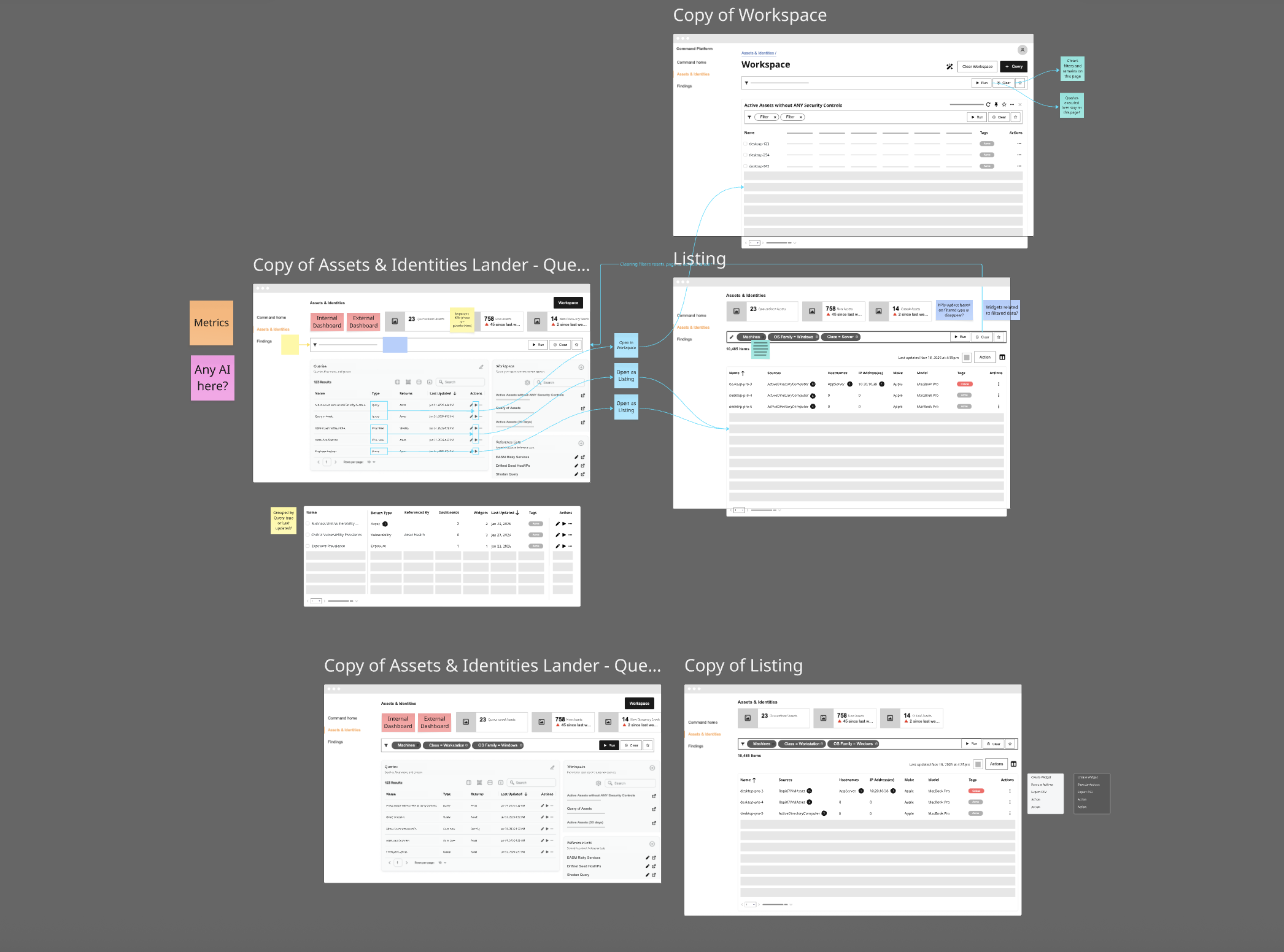
Lo-fi mockup of the new Assets and Identities lander
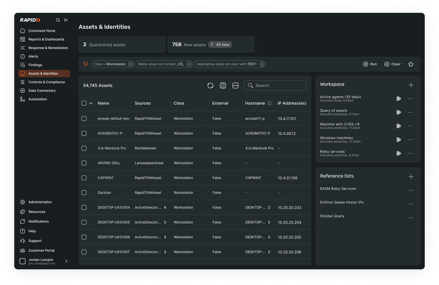
Hi-fi mockup of the Assets and Identities lander